
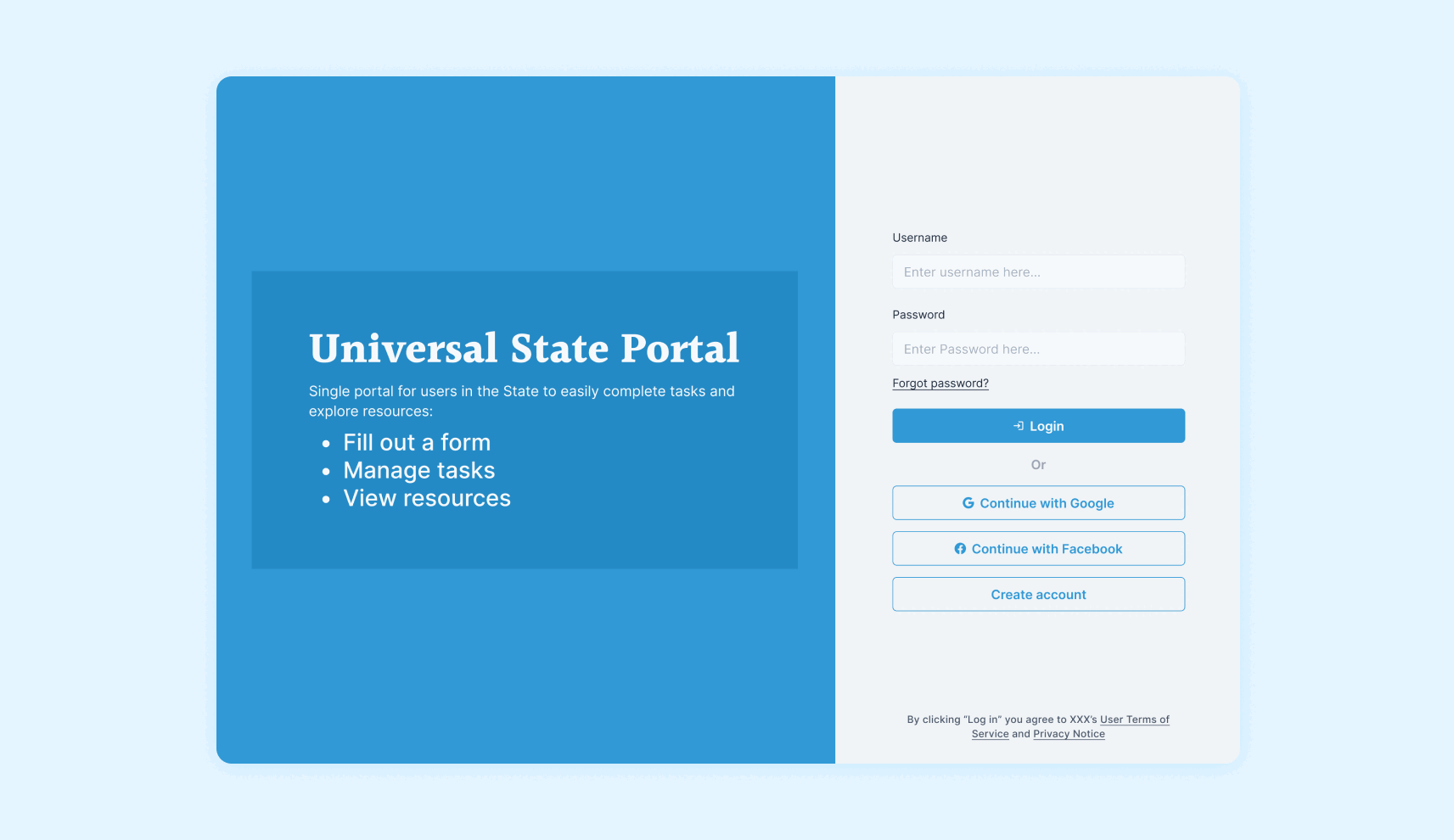
UNIVERSAL PORTAL
Intro: Government dashboards – notoriously complex, often bureaucratic, and a pain for both designers and developers. We’ve all been there, tangled in the weeds of repetitive login flows, clunky forms, and support components. But what if there was a better way? Enter: The Universal portal, a modular design system built to revolutionize government UX.
The spark: It all started with two frustrated designers facing the same task: building dashboards for different government projects. We saw the endless repetition, the wasted time, and knew there had to be a better way. With our manager’s blessing, we embarked on a mission to create a universal toolkit, a shared language for government UX.
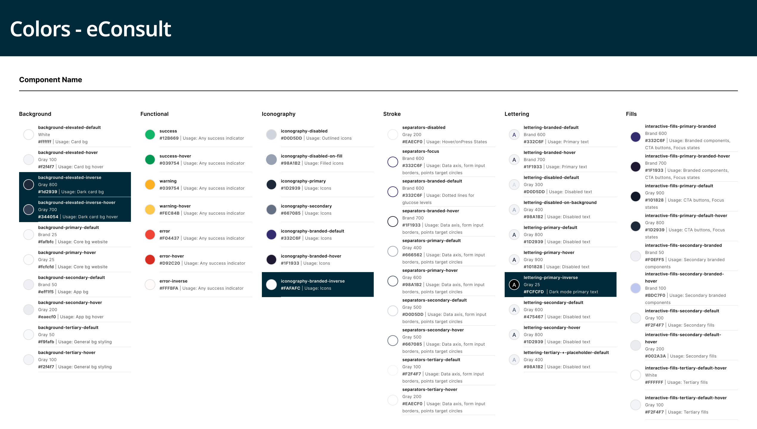
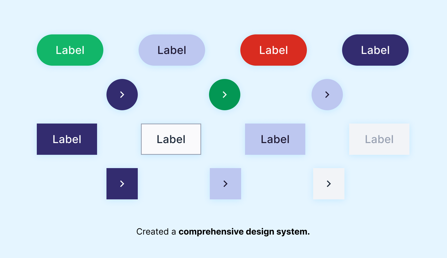
Building blocks: Built on Figma’s variable modes for effortless theming, our design system was pretty comprehensive. We created variants for every component, at every state. Collaboration with the dev team was key, translating designs into reality through an internal AI tool that transforms SVGs into React components with SASS styles. This seamless workflow empowers developers to tap into the system, adding components with ease.
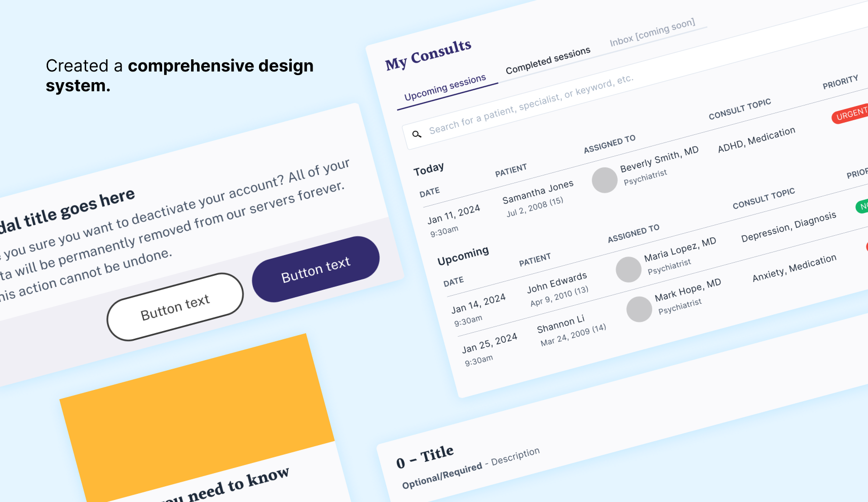
Our process: Our agile approach utilizes rotating developers based on availability, ensuring continuous progress without bottlenecks. To guarantee seamless integration, we developed a robust testing suite, making each component a lego-like block ready for any developer to play with.
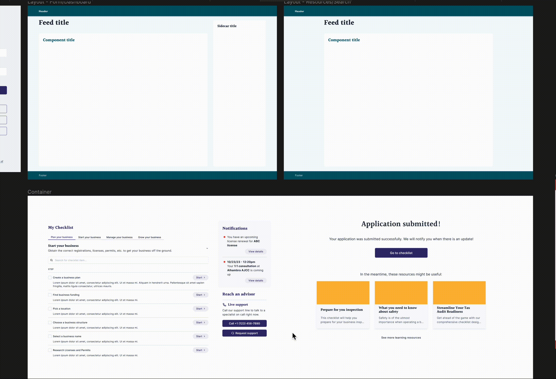
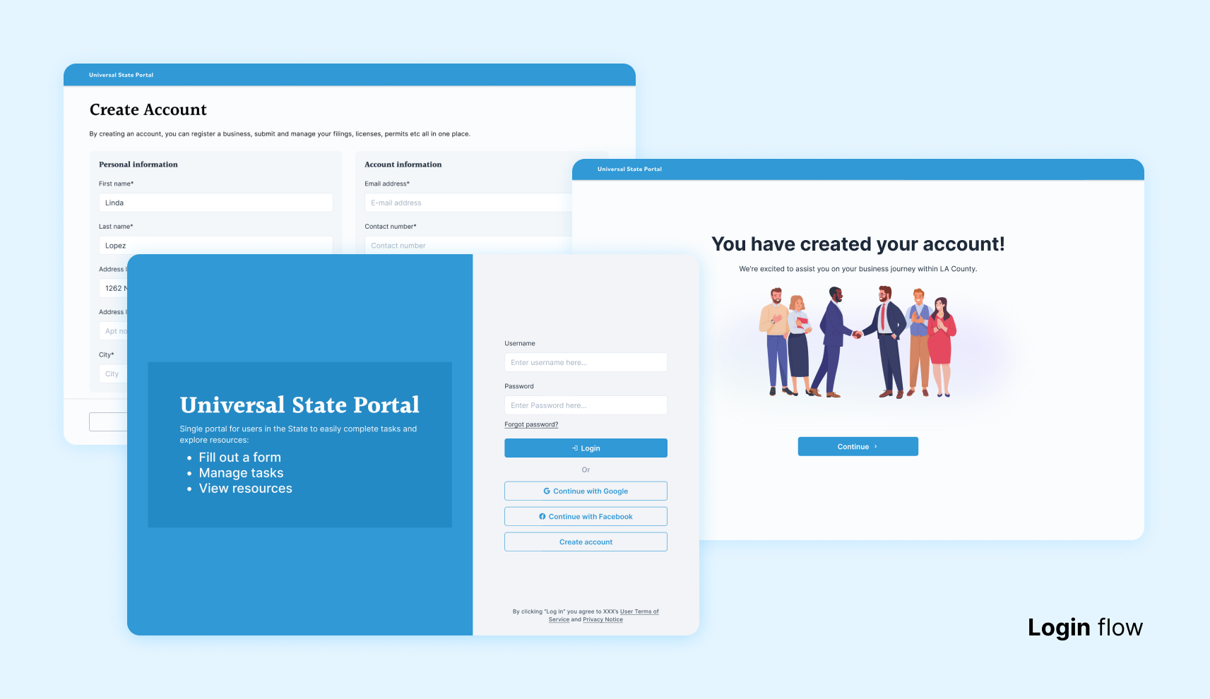
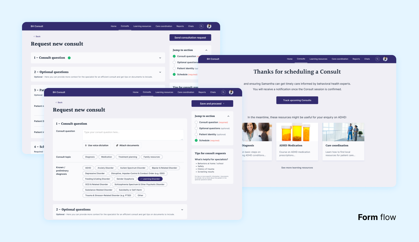
Mix & Match: Components mix and match to effortlessly adapt to diverse needs, validated through rigorous testing with real users. To ensure this modular magic extends beyond individual designers, we tested ease of use with colleagues working on parallel projects. The result? Minimal onboarding and a system that seamlessly scales with any team.
Conclusion: We accomplished the following:
- Live impact: 5+ client projects powered, 2 delivered by yours truly.
- Proposal magnet: 15 pitches featuring the prototypes created with our system, showcasing its value.
- Time saved: Design speed boost of 2+ weeks, measured and celebrated.
✨Thanks for reading✨
Work
About
