VARUNA
Intro: Varuna is a low-cost, beautiful scheduling system for doctors.
Context: This project started in March 2020. When COVID cases were rising in India. My creative partner & I were talking to his mom (a doctor) who was complaining about the medical software she was using.
Problem: We spoke with around 15-20 doctors in our immediate network and found that:
- They were tired of using their hospital’s clunky & ugly digital systems.
- Third party applications were expensive & irresponsible with data collection.
- They wanted something easy to use, and cheap to setup.
Solution: Varuna, a low-cost, intuitive scheduling system for doctors. Check it out here.
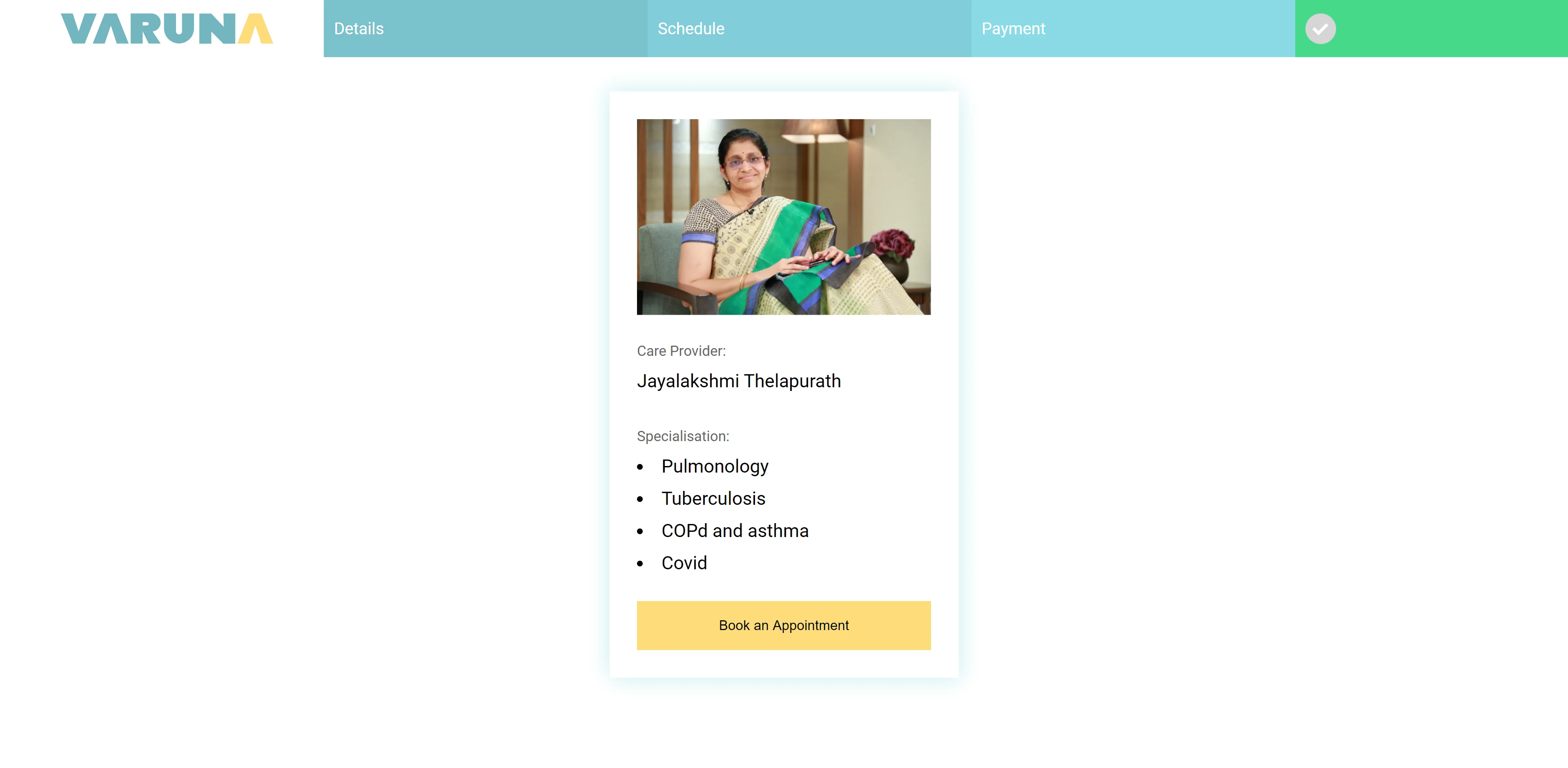
Approach: Our consumers needed a solution immediately. We were in the middle of a crisis. We needed to move fast. So we did. After ideation we just started iterating and making usable prototypes of higher and higher fidelity.
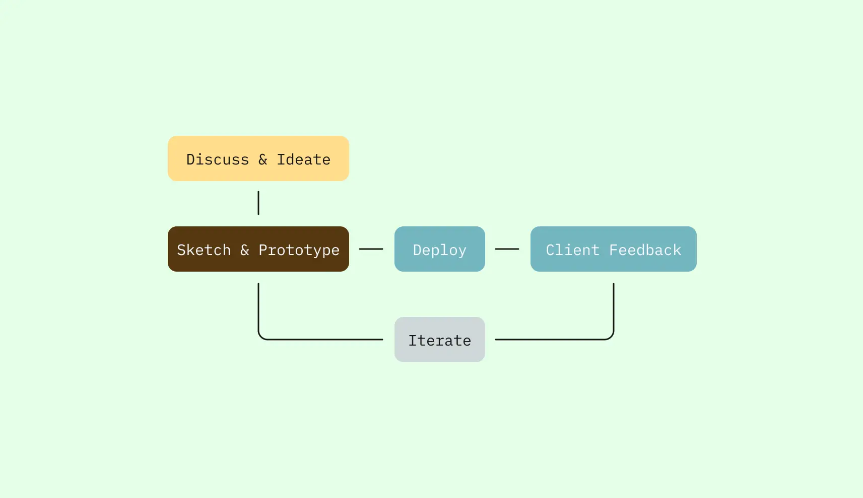
Let me take you through our iterations.
Iteration One: In a few weeks, we built our MVP. We had our friends & family try it out. Our main insights after testing were:
- Onboarding Doctor’s onto the scheduling system was difficult.
- We were a small team, we needed provide a pared down, focused experience.
- The patient facing experience needed to be dead simple.
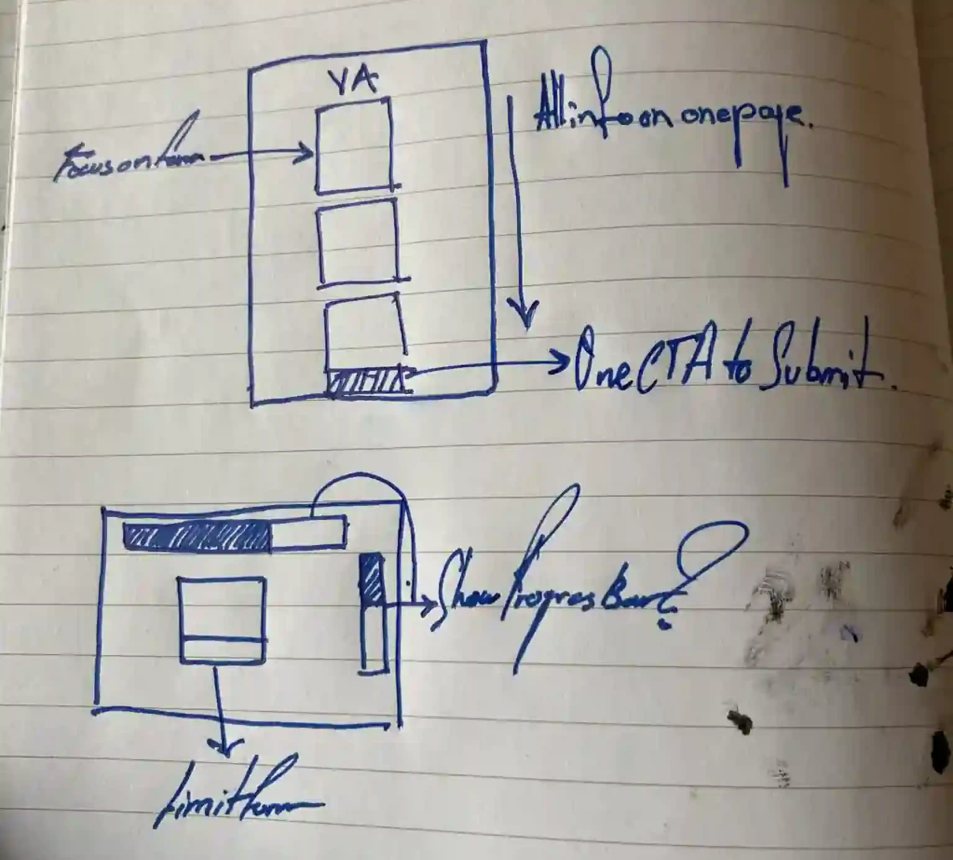
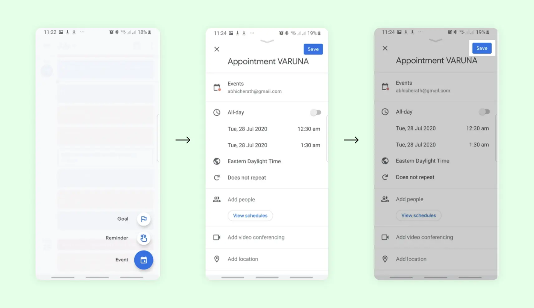
Iteration Two: When it came to onboarding Doctors, we decided that an existing interface was the best interface. We integrated Varuna into the Doctor’s existing workflow. Doctor’s just had to add “VARUNA” to their Google calendar events, & it would automatically list them as available appointments for patients.
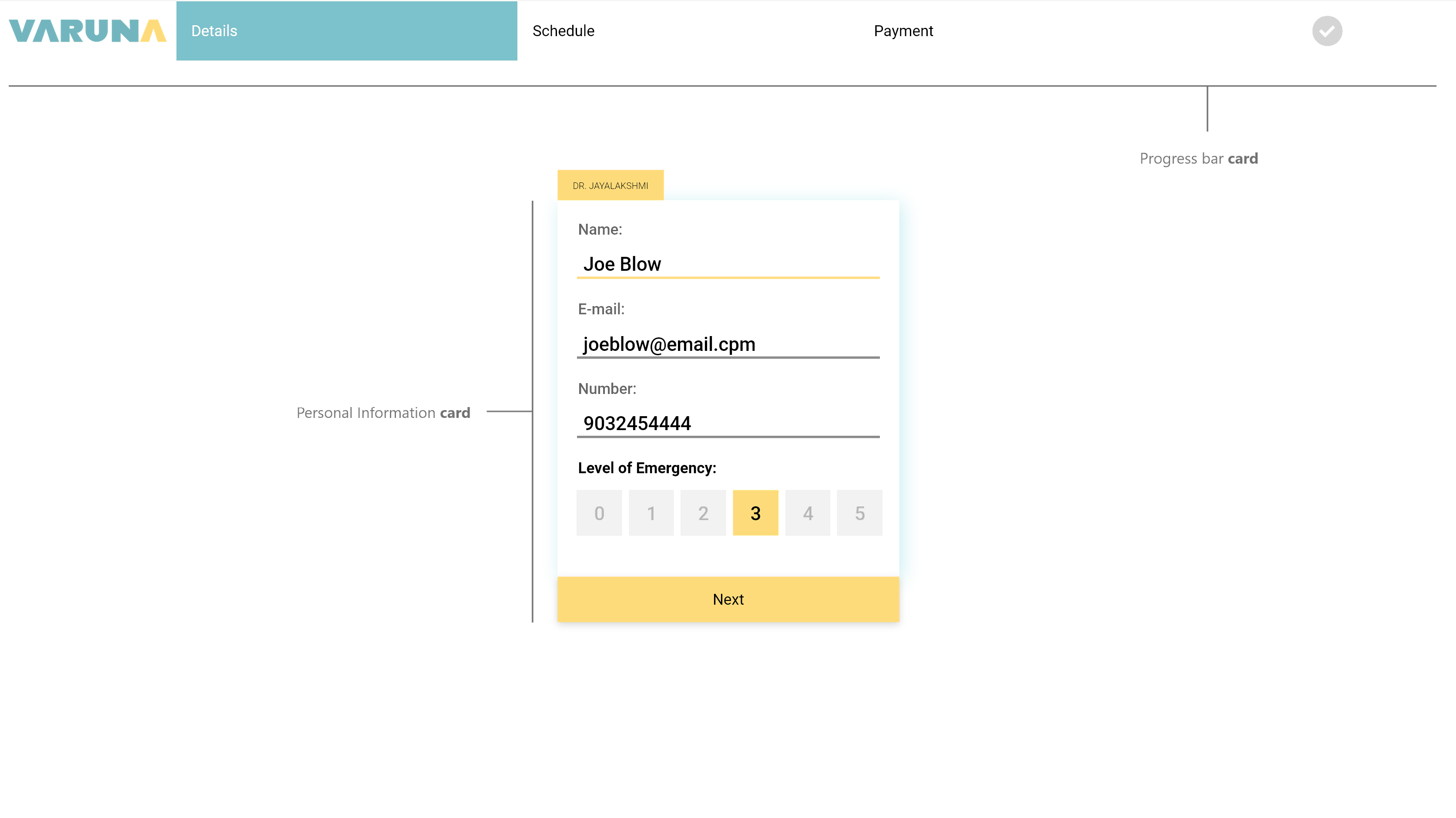
Iteration Three: We refined the UI. Points of interaction & related information were broken up into modules called “cards”. Each card had a single button to progress towards booking an appointment. We created cards by focusing on hard data about pain points in the interface rather than user suggestions.
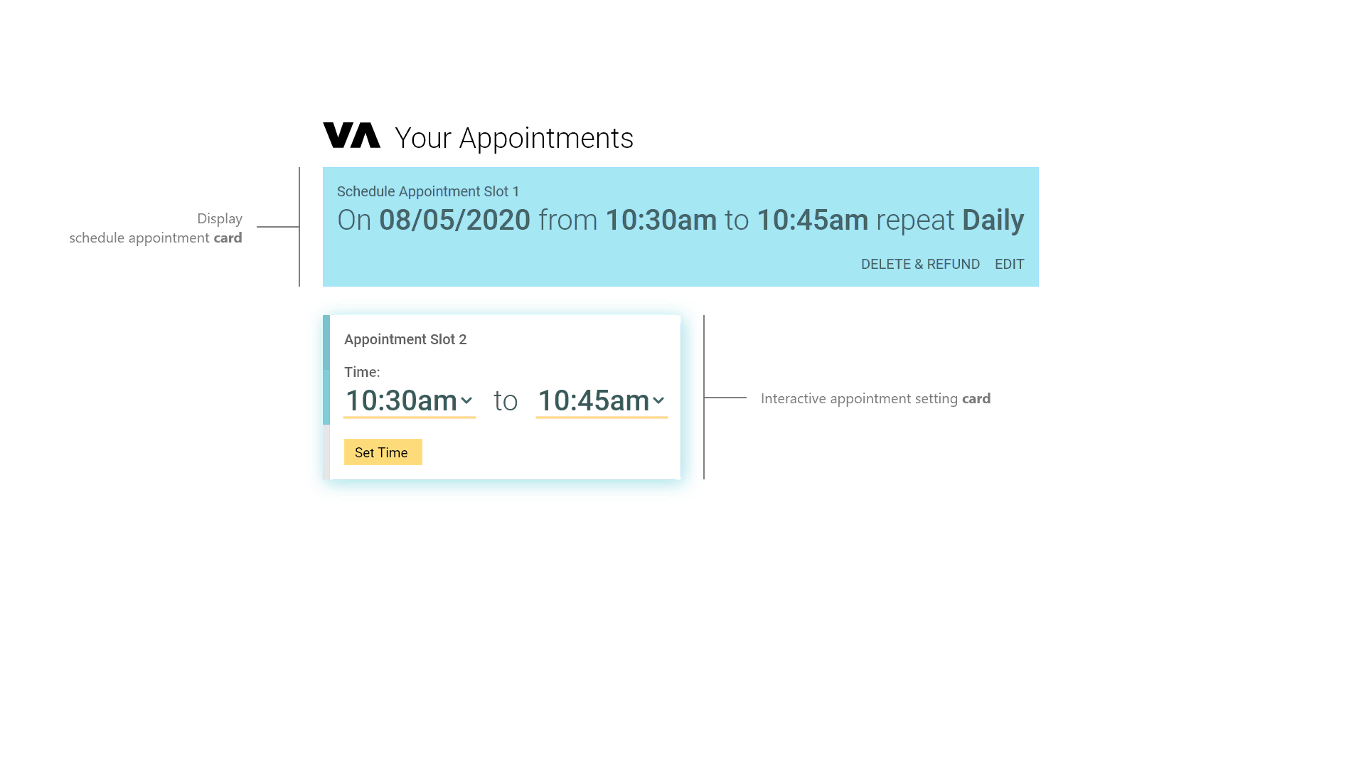
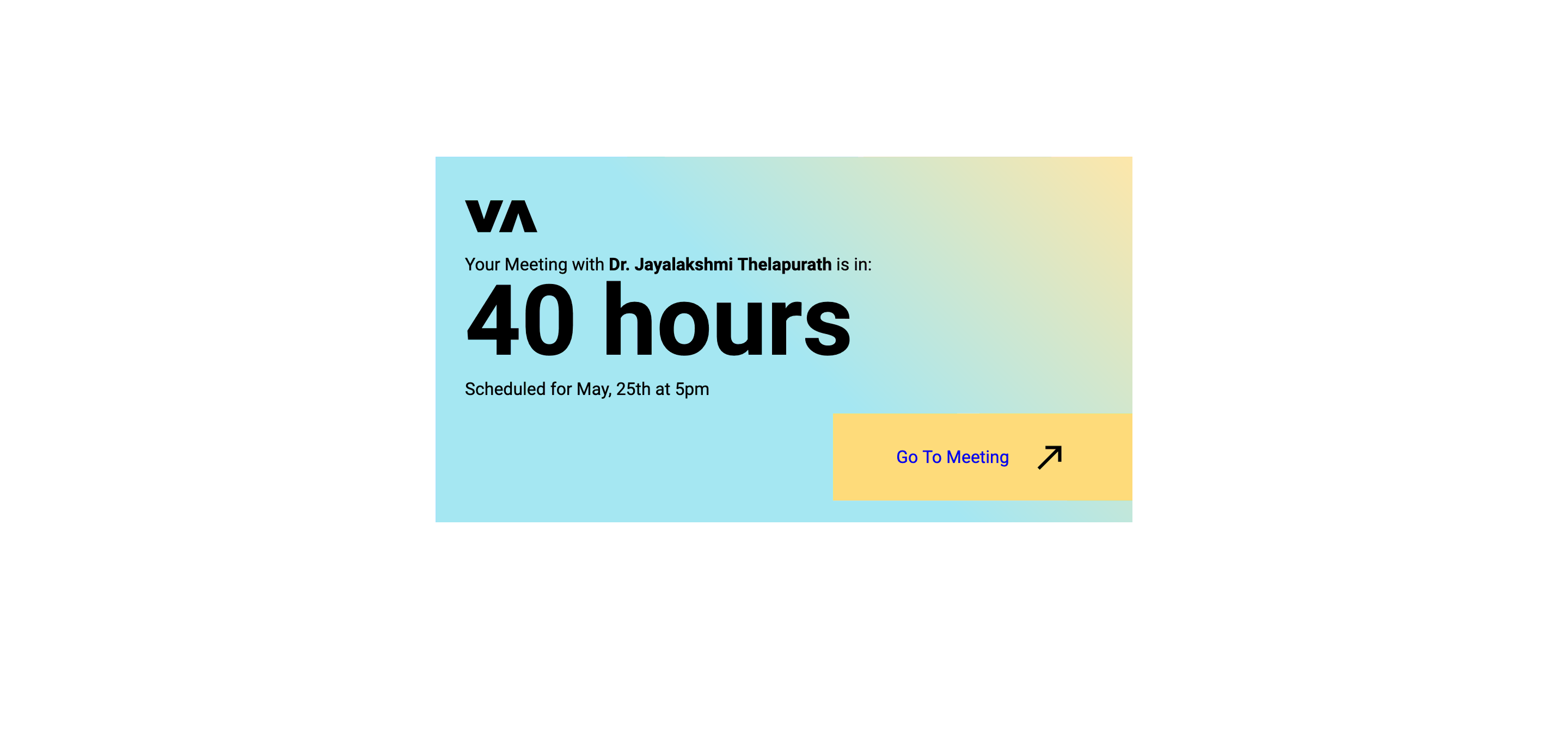
Iteration Four: We needed a way to remind users & doctors about upcoming appointments. So, we started sending reminders through text messages with links the meeting. We also spawned a meeting URLs with a countdown timer & all relevant information.
Conclusion: We successfully designed & deployed a web app that allowed doctor’s to schedule & conduct appointments online. Through live user feedback & data, we rapidly added necesary features & refined the interface. In a few weeks, we were able to provide half a dozen doctors & over 50 patients in Mumbai with the ability to give & receive help through the COVID pandemic.
Lessons: This project was very formative for me. It has very much influenced so much of how I approach design today. Here are some high-level take-aways:
- Keep your design simple. Helps you make complex projects.
- Pay attention to the data. User opinion should follow data, not the other way around.
- Use existing interfaces when you can. The user will be more comfortable in familiarity.
✨Thanks for reading✨